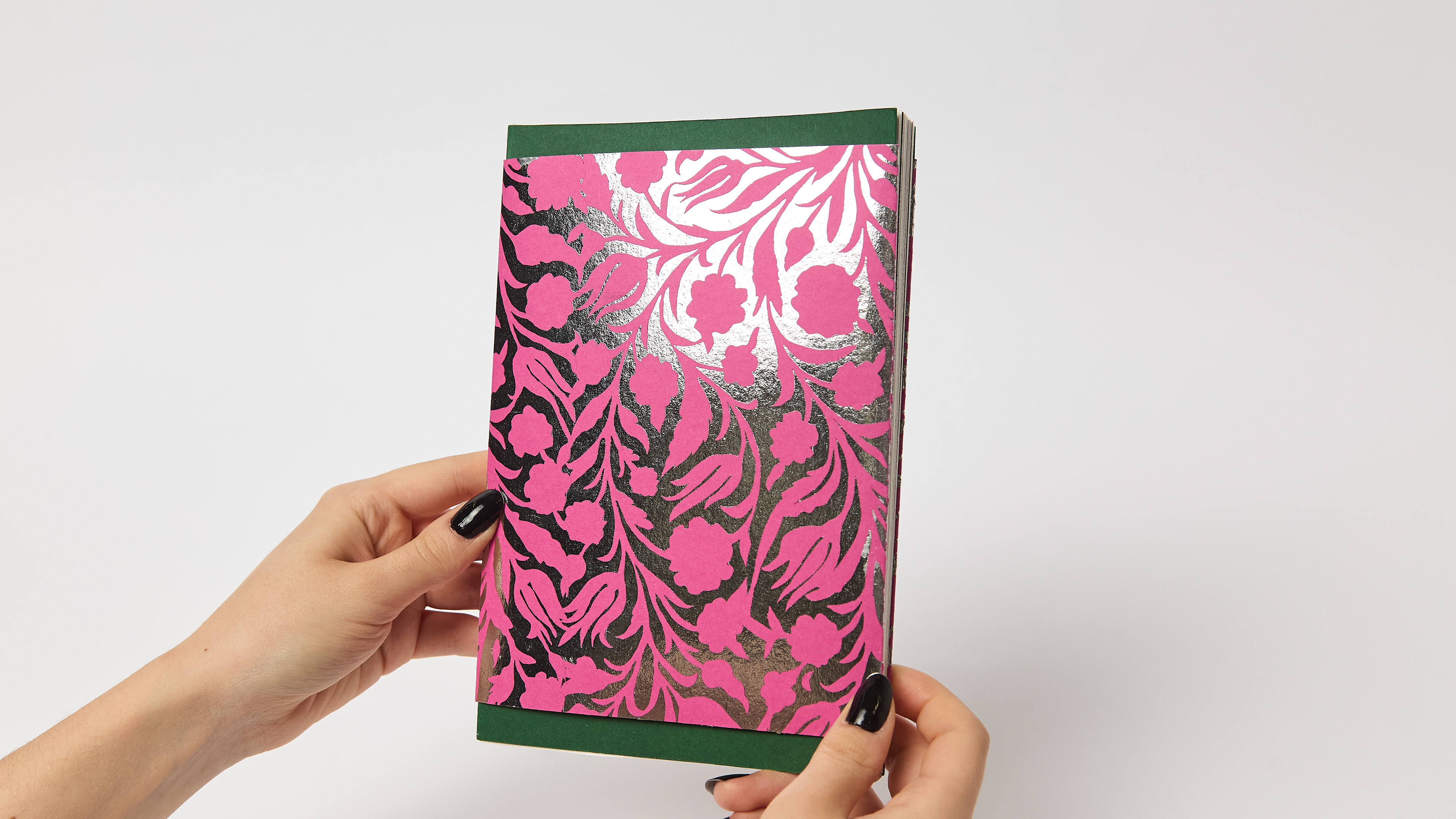
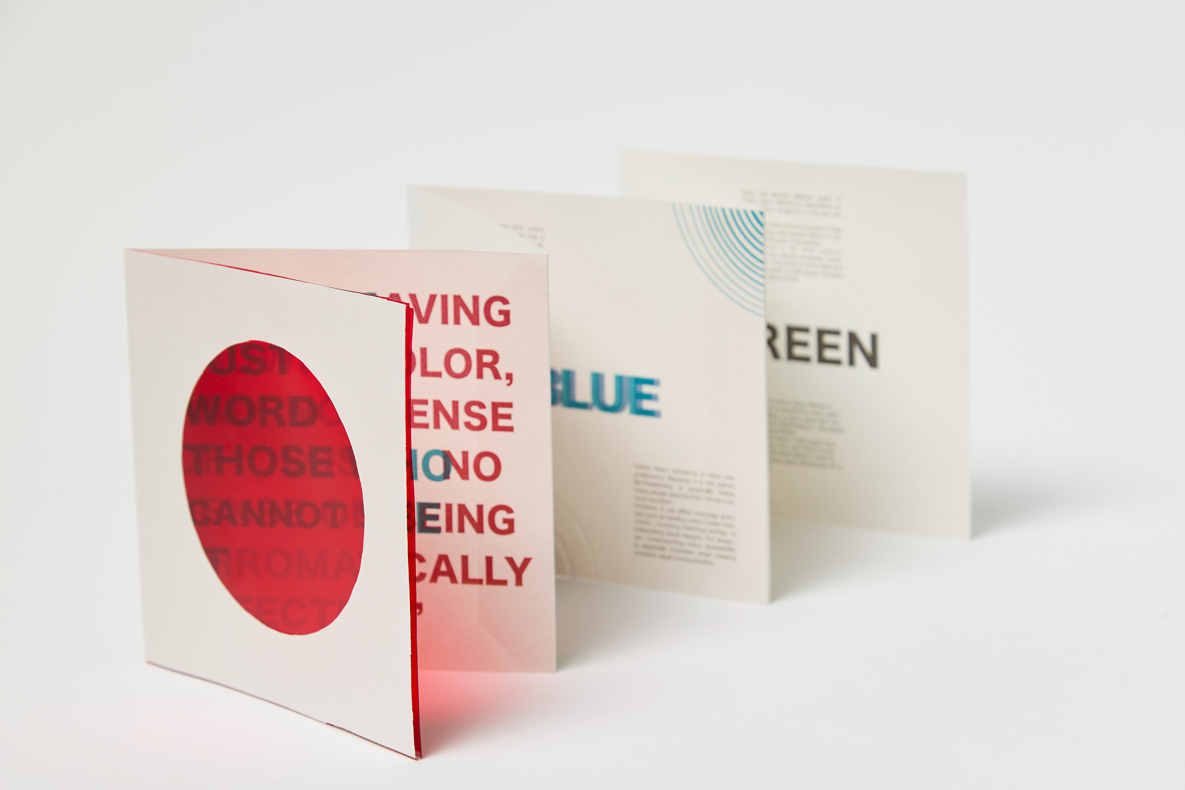
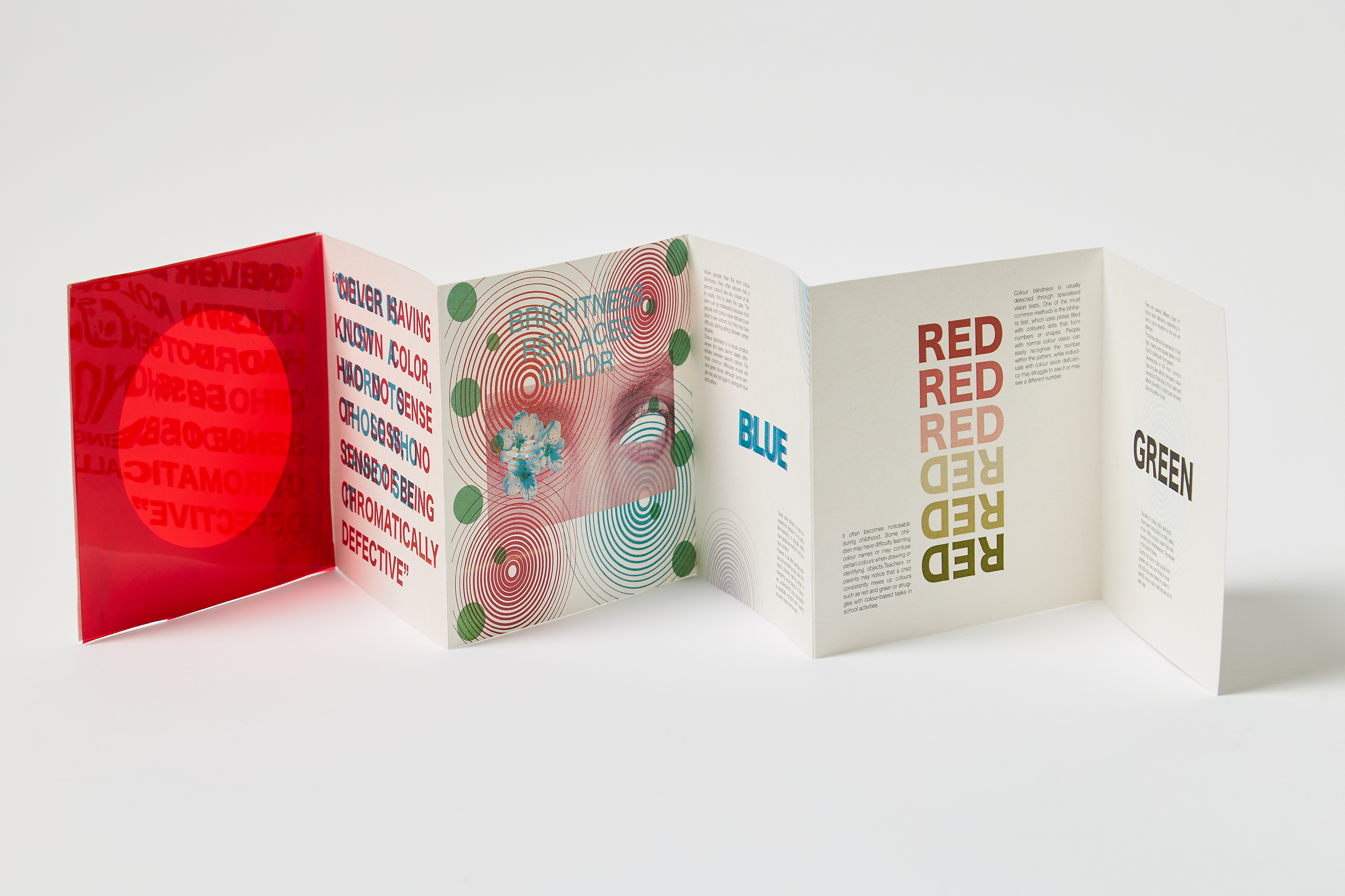
This project was developed in response to the brief Power, where I explored how colour can influence communication and perception. During my research into the psychology and meaning of colour, I became interested in colour blindness and how visual information can be experienced differently by different audiences. This led me to create an informative concertina publication focused on raising awareness of colour blindness and the challenges it can create in everyday life.
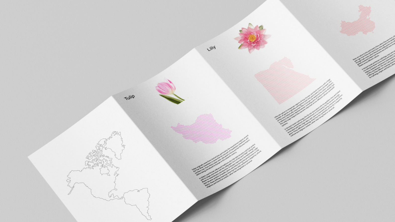
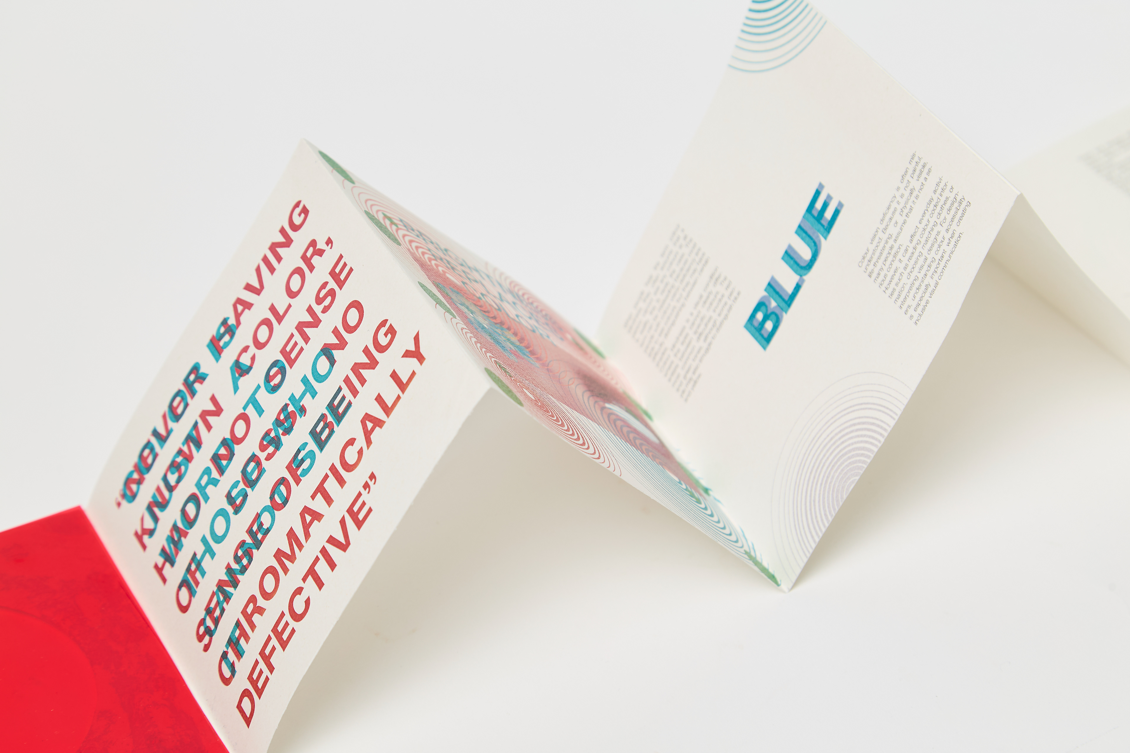
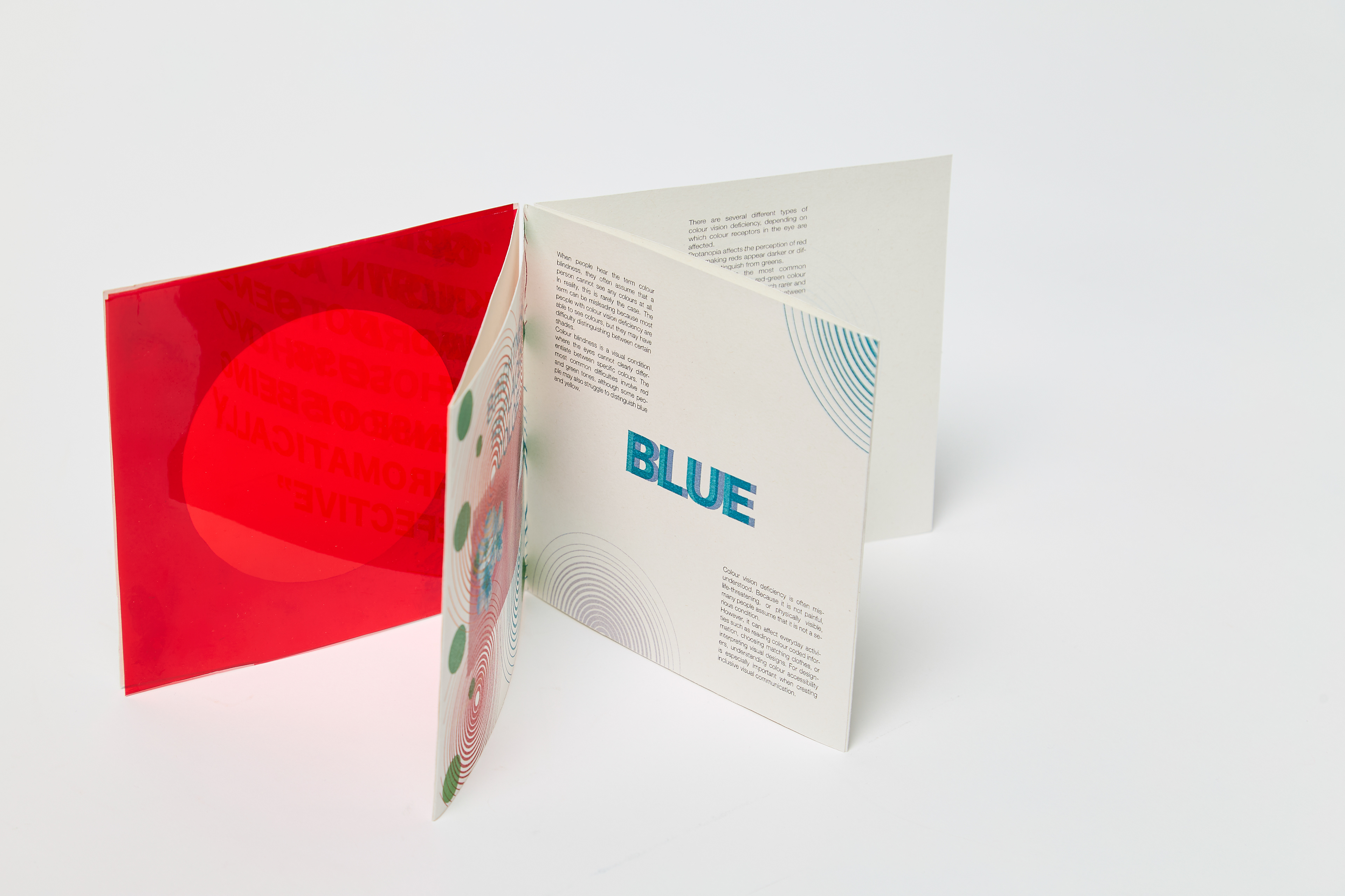
The publication includes information about three different types of colour blindness, using layout, colour, and interaction to help communicate these experiences visually. I wanted the design to be both educational and engaging, encouraging the audience to interact with the publication rather than simply read it.
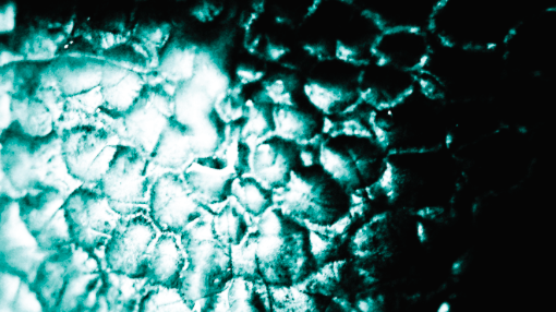
To make the concept more immersive, I designed the first page as an interactive element using a red filter, where the hidden text can only be read through the coloured overlay. This allowed the audience to experience how colour and visibility can affect the way information is understood. Through this project, I developed a stronger understanding of editorial design, information hierarchy, and user interaction while exploring how graphic design can be used to create awareness around accessibility and inclusion.