Description
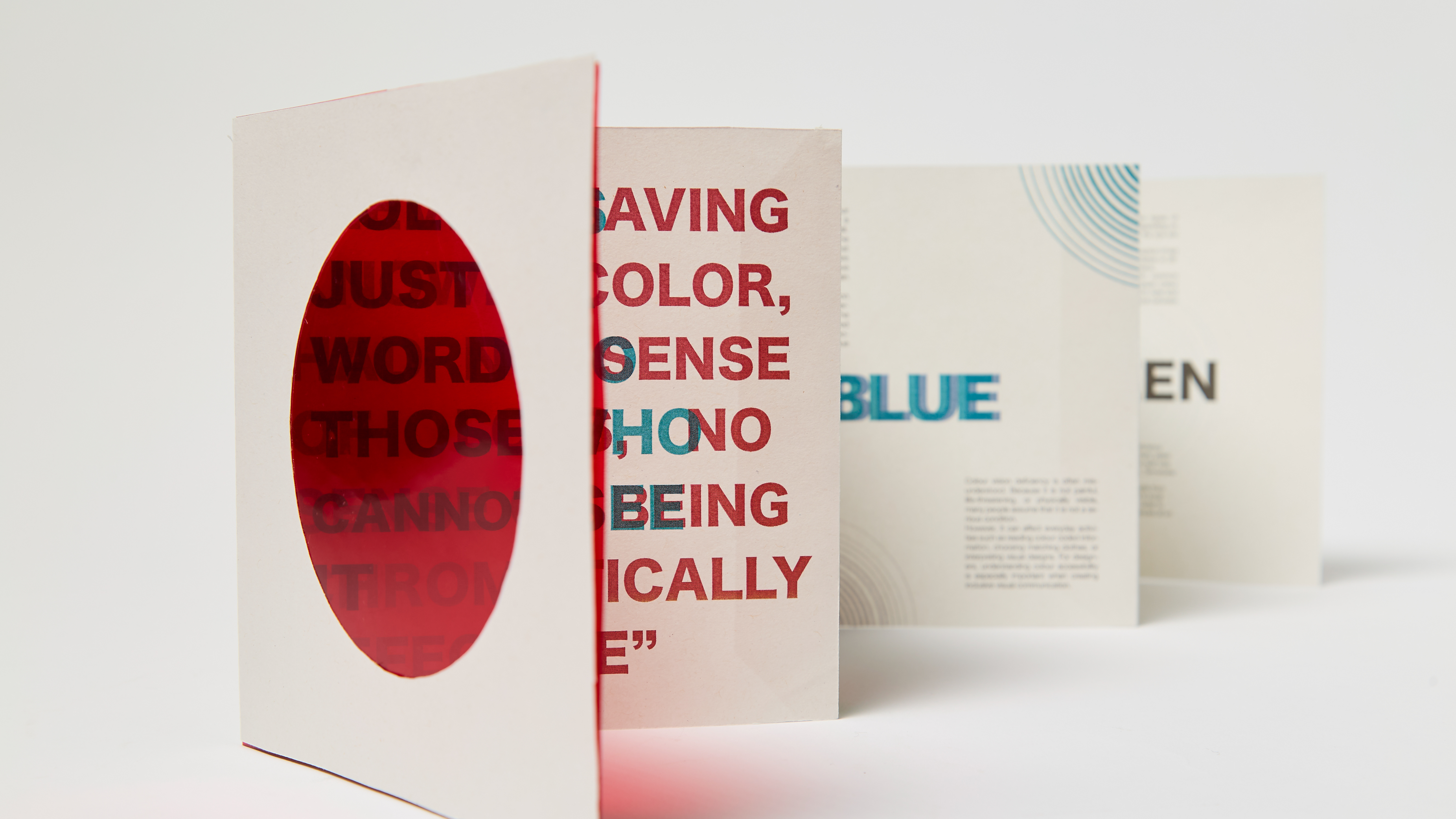
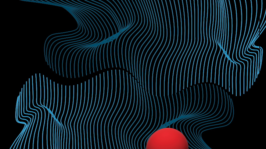
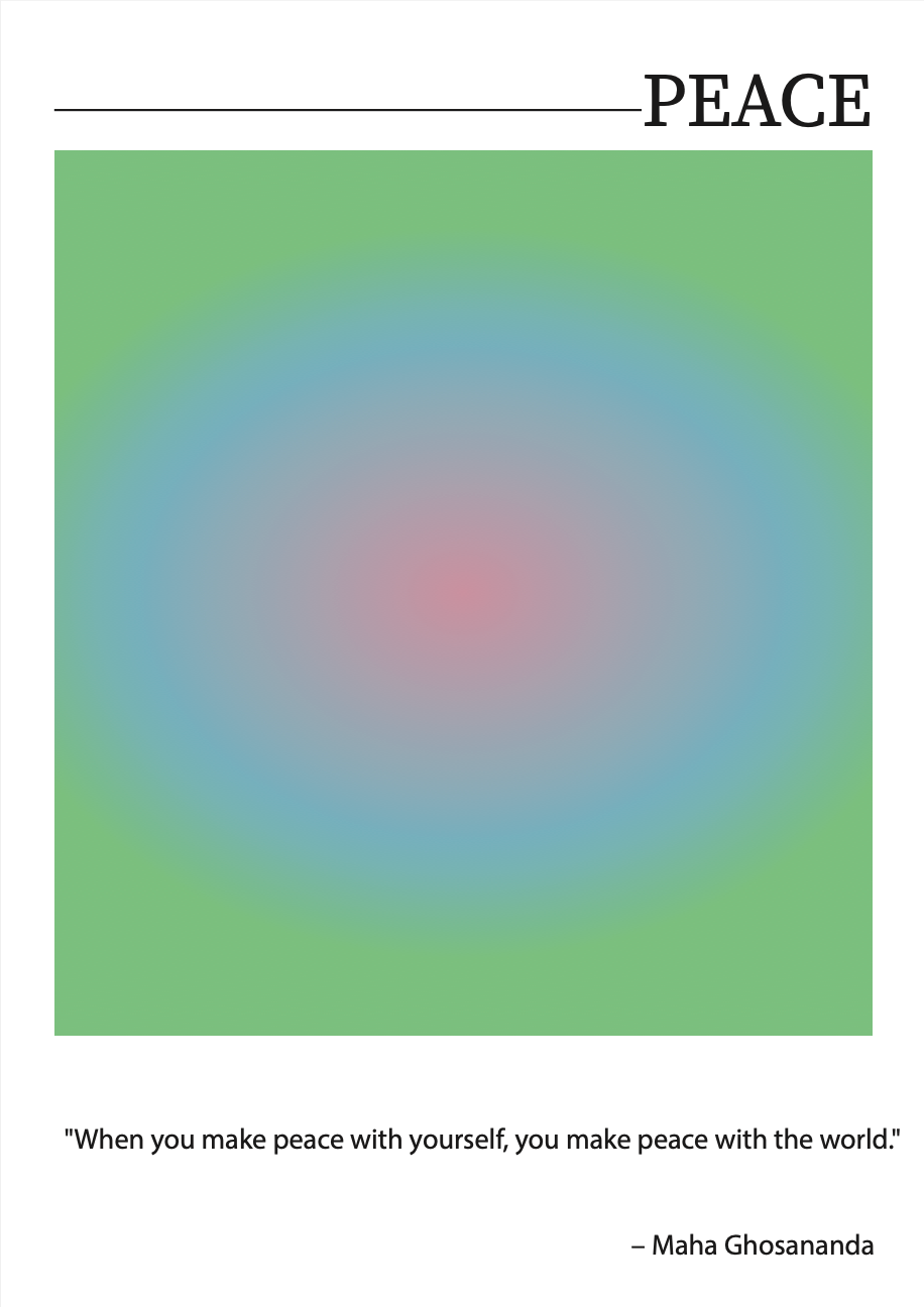
In this series of posters, I wanted to explore and express emotions through color, presenting them from my personal perspective. Each design is carefully crafted to represent a different emotion, using color as the main tool to convey the feeling. By combining vibrant hues, gradients, and subtle shifts in tone, I aim to create a visual experience that resonates with the viewer, evoking emotions in a direct and impactful way. This project is a journey through how I interpret feelings, using color to speak where words often fall short.
Description
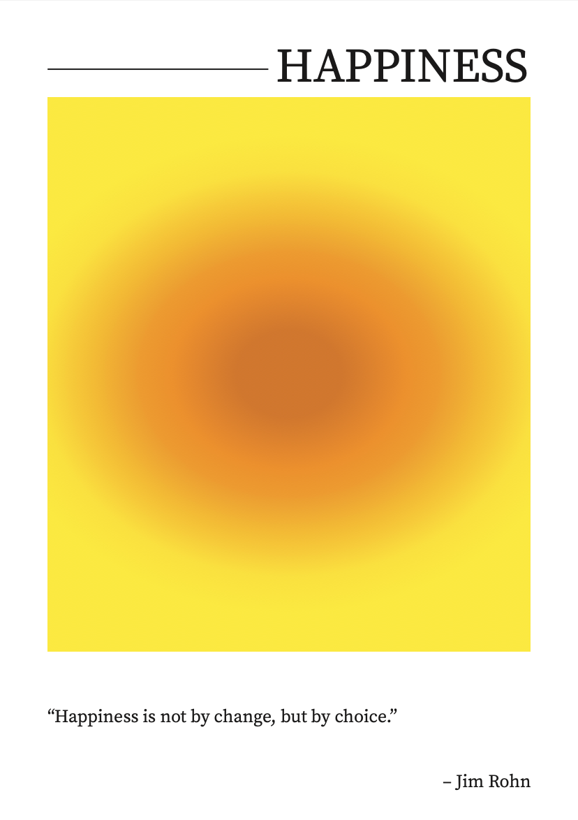
The 'Happiness' design features a bright yellow backdrop, radiating energy and positivity, while the central orange gradient deepens from light to dark, symbolizing the depth and growth of happiness over time. The quote, 'Happiness is not by chance but it’s by choice,' is a powerful reminder that happiness isn't something that happens randomlyit’s something we actively choose to cultivate.
In the context of work, this serves as a reminder that our mindset and attitude toward our careers can shape our overall happiness. It encourages us to take responsibility for our own well-being and make conscious decisions to find joy in the process, regardless of the challenges we face. The design and message together inspire reflection on how we can choose happiness, not just as a fleeting emotion, but as an ongoing choice in both our personal and professional lives
Description
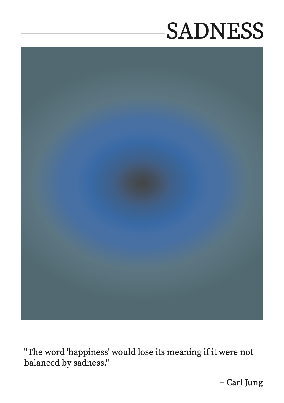
The 'Sadness' poster is designed using a blue-greyish color scheme that evokes a sense of melancholy and introspection. The gradient flows from a soft, muted blue-grey at the edges to a deeper, bluish tone, symbolizing the gradual intensification of sadness. At the core of the design, the gradient transitions into black, representing the emotional weight that can feel all-encompassing in moments of sadness.
The quote, 'The word happiness would lose its meaning if we’re not balanced with sadness,' is thoughtfully integrated into the composition, highlighting the delicate balance between joy and sorrow. The deep black center serves as a visual anchor, reminding us that sadness is not only an inevitable part of life but also a necessary counterpoint to happiness. This poster invites viewers to acknowledge the depth of sadness, reflecting on how our experiences with both light and dark emotions shape our understanding of ourselves and the world around us.
Description
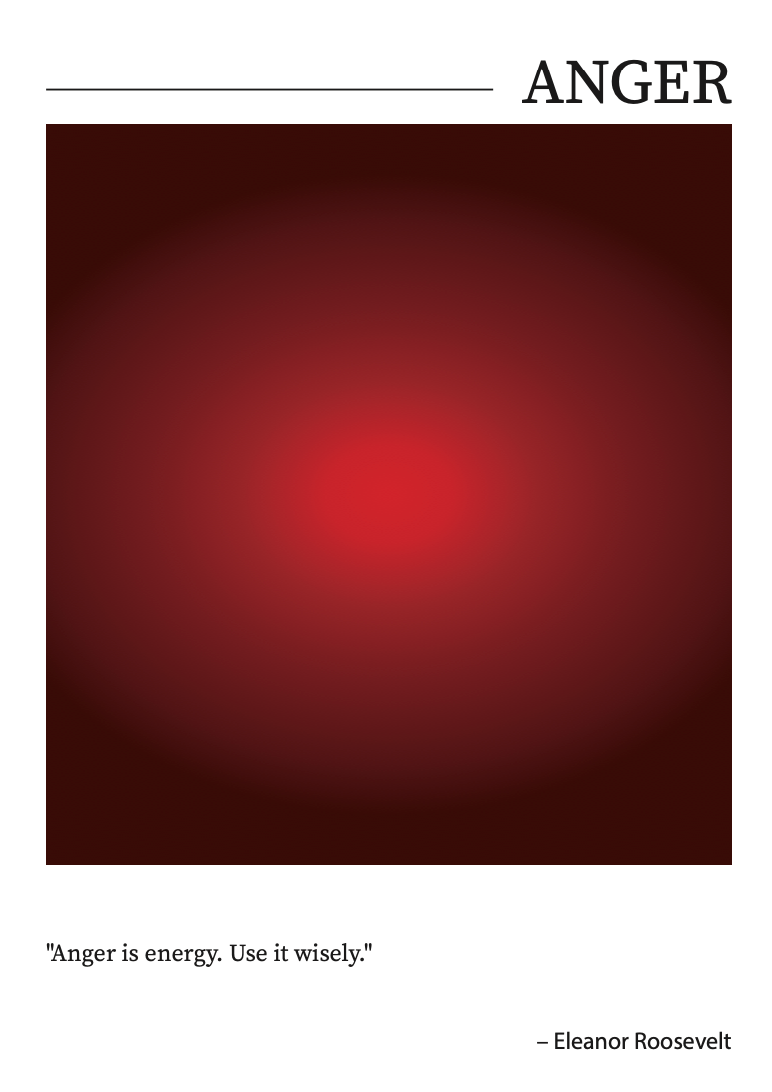
This poster embodies the fiery and intense emotion of anger, represented through a dramatic gradient of dark red transitioning to vibrant red tones. The deep, dark reds reflect the simmering intensity of anger, while the brighter reds symbolize its explosive and energetic nature. The gradient radiates heat and movement, visually capturing the raw power of this emotion.
Paired with the quote, "Anger is energy; use it wisely," the poster reframes anger as a force that, when channeled effectively, can drive positive change and action. This design encourages viewers to see anger not just as a destructive emotion but as a powerful energy that can be directed toward growth and transformation. The combination of dynamic visuals and empowering text makes this poster a compelling exploration of anger’s dual nature.
Description
Description
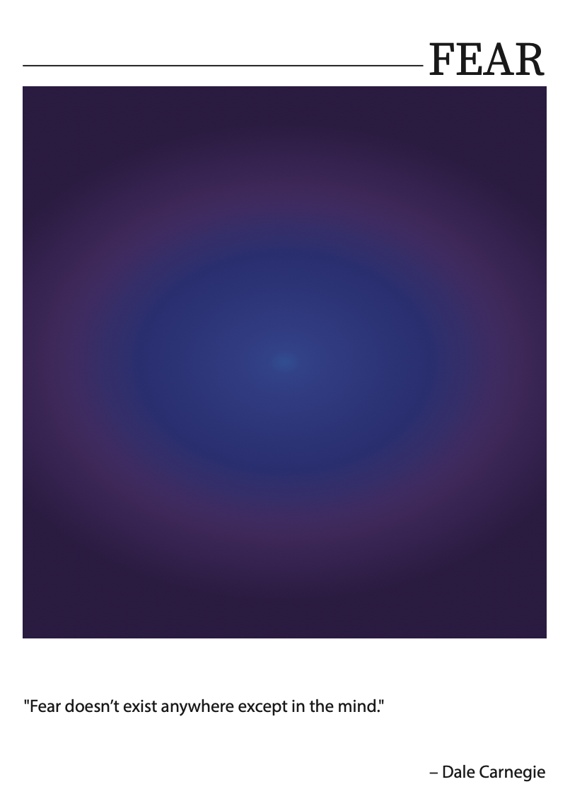
This poster delves into the emotion of fear, conveyed through a dark, moody gradient of deep blues and purples. The design creates a feeling of unease and intensity, pulling the viewer into the depths of the unknown. The darker tones represent the shadowy, consuming nature of fear, while the faint glow at the center hints at the possibility of overcoming it, as light often emerges from darkness.
Accompanied by Dale Carnegie’s quote, "Fear doesn’t exist anywhere except in the mind," the poster challenges viewers to confront the psychological roots of fear. It combines visual and textual elements to evoke introspection and a reminder of the power of perception in shaping our emotions. This piece encourages the audience to face fear and embrace courage.
Description
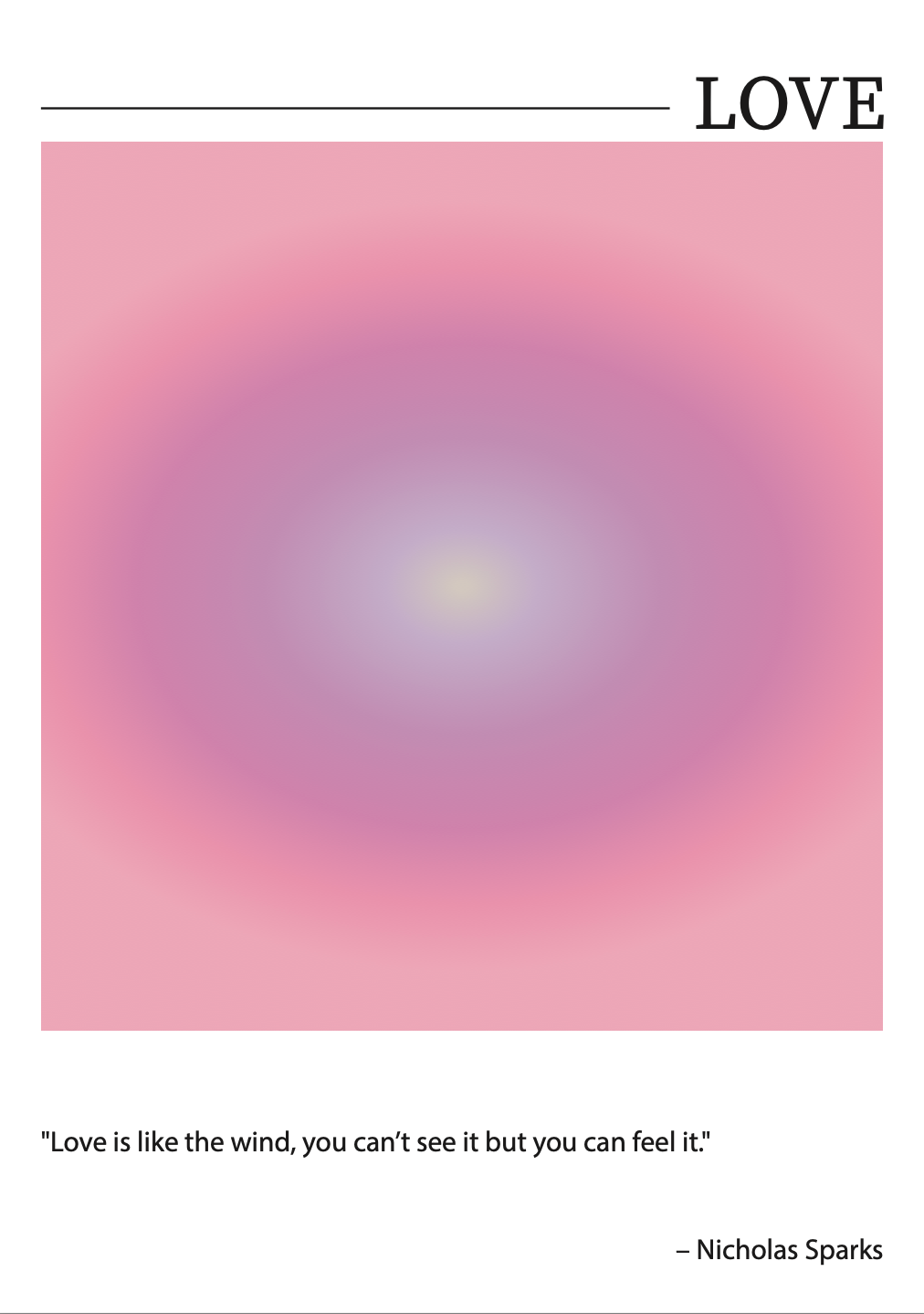
This poster embodies the emotion of love, expressed through a soft and harmonious gradient of pink and purple hues. The gentle transition between colors symbolizes the nurturing and calming nature of love, while the warm, radiant center reflects its powerful, heartwarming essence. The circular gradient design conveys inclusivity, wholeness, and the unending cycle of love that connects individuals and communities.
The accompanying quote by Nicholas Sparks, "Love is like the wind, you can’t see it but you can feel it," emphasizes the intangible yet deeply impactful nature of love. By pairing visual and literary elements, the poster invites viewers to reflect on the invisible yet palpable ways love manifests in their lives. It aims to create an emotional resonance, leaving an impression of love's universality and profound significance